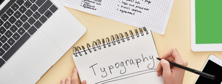
The Power of Typography in Web Design
Typography is important in web design as it’s the tool that conveys the message of a website. Topography is the bringing together of letter arrangements and text that is clear, understandable and visibly pleasing to the reader. It also includes the style of font and the structure that is directed at stirring feelings while delivering precise messages. Typography is the device that gives life to your text and there the power lies.
Today, we connect typography with website and print design. Actually, the internet set off an eruption of typography. Web designers like Hyland Graphic Design & Advertising use a multitude of fonts and different options for type in their designs. Typography is a visually distinct operative in web design.
The Importance of Typography
Typography is a necessary element in web design as it leads to clear communication. Its importance lies in its ability to bring a balance to a website. You want typography to provide a vivid visual order, bring a descriptive balance to a website and set the tone for a product. Typography should also direct and inform site visitors, ease reading ability and guarantee a positive experience for the user.
Whether you are looking at your phone, a book or a website, the written word is constantly in our presence. Type is forever with us through booklets and other places. The written word is powerful, but most of us don’t even recognize that a designer has a powerful role in representing the tone of the word.
Typography Creates Brand Recognition
Website users will unconsciously associate the lettering you use with the product or service you provide. Exclusive and uniform typography helps you build a consistent following. Unique, consistent typography will help you establish a strong user support and build trust with users, and help to carry your brand forward. Any Philadelphia branding and design agency should be able to help you choose the typography that will coordinate with your site and brand.
Typography and Decision Making
Type that is striking has a large impact on decision making with a website. Type fonts have a serious effect on how website users absorb and process information as text. Striking type is a persuasive way to reinforce a message as opposed to delicate fonts that aren’t able to strengthen the message that the text hopes to deliver.
Typography Maintains Readers Attention
For a user to remain on a site longer than a few minutes, the importance of stimulating typography keeps users returning to and staying on a site. That’s the importance of creating visually inspiring typography on your website. Making it impressive will keep a reader’s attention.
Elements of Typography
There are essential elements in typographical design, and they include the following.
- Fonts and Typefaces
A font is a pictorial representation of characters that includes their styles, widths and weights. it’s a member of a typeface.
A typeface is a style in design that comprises distinct characters of differing sizes and weight. It’s a whole family of fonts that are related by their styles, widths and weights.
Typeface Types
Typeface consists of three different kinds of typeface that include
- serif
- sans serif
- decorative
Creative companies in Philadelphia and their designers usually won’t use over three different fonts and will reserve decorative fonts for special projects. Designers will put serif fonts with san-serif fonts. They like the main part of a text in a serif font and the title of the text in a sans-serif font, or they may switch to the other way around.
Contrast with fonts helps to get across messages you want to highlight to anyone reading on a site. Interface designers put across ideas to stress with readers and investing time in contrast creates interesting, purposeful and eye-catching text. Designers generate contrast by experimenting with different typefaces and type styles, colors and sizes to help split up the page.
Different Types Used for Consistency
Consistency – To avoid a misleading and sloppy connection, you want to keep your typeface consistent. Getting across information is important, and that means remaining with a similar font style. You want readers to see a pattern. It’s alright to change around your font styles, but it’s always good to have consistency with typefaces. It’s practical to use the same fonts for headers and others for subheadings and remain with those typefaces throughout a page or website.
White space – White space or negative space is the area around the text or any graphics. It keeps an orderly interface and text is easy to read. White space draws the reader’s attention to the text and brings a pleasant feeling to the whole page. White space is also part of margins or other areas that are minus text, images or graphics.
Alignment – Alignment is the method of joining and creating text, images and graphics so they show uniform space, size and distances between each component. User interface designers construct margins to make sure their header, body and logo are connected with one another. It’s always a good idea to watch for industry standards that align text on the left-hand side of a page, as that’s how a reader will read on a site.
Color – Color is a dramatic element of typography. A designer can really use their creativity and bring the interface to a polished level. Pinpointing the right font color makes the text emerge and communicate your message’s tone. When the colors aren’t right for the page, you’ll have a sloppy interface and text the simply doesn’t go with the site. A good user interface designer will balance color and know that its components are value, hue and saturation. They’ll balance these components and make sure the text is both striking and understandable.
Hierarchy – Hierarchy is one principle that is the most critical in typography. The process is to make a coherent distinction with the obvious content that needs to be noticed and read first. Short attention spans make designers aware that creating succinct typefaces is necessary. You want users to take in the most valuable information in a short time. An example of hierarchy is in the size of headings. You want them to be bigger than any subheading and standard text.
Typography in web design is a powerful tool. If you’re still not sure how typography is used in website design, contact Hyland Graphic Design & Advertising at (484) 879-6145. They’ll answer questions you may have and lead you down the right path for web design.


